AI at Work
5 Best Landing Page Examples and How to Create Them with AI Content Creators

Akshita Sharma · Content Marketing Associate
February 4th, 2025 · 17 min read

While a good website serves as a foundation for developing a strong online presence, the real opportunity lies in strategically expanding your landing page portfolio. The more landing pages you have, the more opportunities there are to convert prospects into customers. And the numbers speak for themselves: websites with 10 to 15 landing pages can generate 55% more leads than those with fewer pages.
But scaling landing page creation has traditionally meant choosing between speed and quality—a painful tradeoff for teams targeting diverse audience segments. While personalization can drive measurable results (leading to 10-15% revenue lift), creating multiple variations of your landing pages manually strains resources, with each personalized page requiring careful adaptation of messaging, social proof, and value propositions. That's where an enterprise-grade AI solution can be incredibly useful.
With a little help from Typeface's AI, you can rapidly test, iterate, and scale your landing page strategy without sacrificing quality and brand consistency. In this blog, we'll show you some effective landing page examples and provide actionable tips on how to leverage Typeface’s AI tools and templates to recreate these landing pages.
What makes a good landing page?
5 landing page examples for inspiration
How AI content creators simplify landing page creation
What makes a good landing page?
Creating an effective landing page involves several key elements —each precisely optimized to drive qualified prospects through your conversion funnel.
Engaging visuals: This is perhaps the most crucial aspect of any landing page. Visuals go beyond mere decoration; they play a pivotal role in conveying your message and capturing the attention of your audience. According to Gartner, 48% of website visitors leave the primary landing page without engaging deeper with any marketing collateral, indicating that effective visuals are crucial for capturing attention and reducing bounce rates.
A clear and compelling headline: Instead of broad value statements, craft headlines so that they address specific audience problems and desired outcomes.
Conversion-engineered copy: Your prospects are likely seeking content that validates their purchasing decisions. This means that your copy should weave together useful insights, concrete metrics, and clear differentiation points that highlight the unique benefits and value your product or service offers. Each paragraph should methodically build your case while addressing common enterprise objections.
Strategically positioned CTAs: Your CTAs must align with where prospects are in their buying journey. This means offering multiple conversion paths on your landing page—from high-level white papers for early-stage research to direct demo scheduling for qualified buyers—all optimized for above-the-fold engagement.
Trust signals: Adding testimonials, reviews, and trust badges to your landing page can also boost credibility and trust.
Every element plays a unique role in drawing the audience’s attention and building trust, but they must flow seamlessly into a cohesive narrative that guides prospects toward conversion. This is where AI content creators come in. By leveraging AI, you can automate many aspects of landing page creation and ensure hyper personalization at scale. It also ensures that all the content aligns perfectly with your brand voice and visual style.
Typeface’s AI content platform offers several AI templates to help you create persuasive landing page copy tailored to your target audience and brand goals. Using its content AI repurposing templates, you can turn any document, webpage, video, or text into a landing page copy.
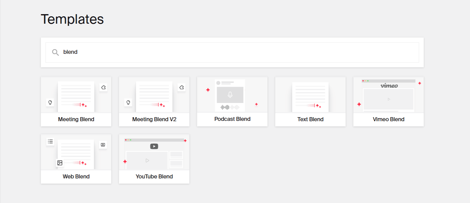
The platform also features an AI-powered Image Studio for generating landing page visuals and banners.
In the following sections, we'll show you how to use these AI tools and templates for crafting well-optimized landing pages. Before that, let’s take a look at some landing page examples.
5 landing page examples for inspiration
To understand what makes a landing page effective, here are some landing page examples showcasing various landing page strategies and designs that have proven successful in capturing leads and driving conversions.
1. Lead capture pages
Lead capture pages are designed to collect visitor information like names and email addresses in exchange for gated content, like eBooks, webinars, videos, or anything else. The information collected in the process is then used for precise audience segmentation, personalized nurture journeys, and sales intelligence, helping businesses grow their customer base and engage with their audience more effectively. A good lead capture landing page should contain a clear value proposition, a strong call-to-action, a simple form to fill out, and a design with minimal distractions.
Here’s an example of a Forrester webinar landing page that offers exclusive 2025 predictions for B2B marketing and sales strategy. The prominent "RESERVE YOUR SEAT" call-to-action in contrasting yellow guides the eye and prompts visitors to take action. The page also creates a sense of urgency through its "once-a-year event" framing. As for the value proposition, it is immediately clear - access to research-backed insights and expertise of well-known speakers.
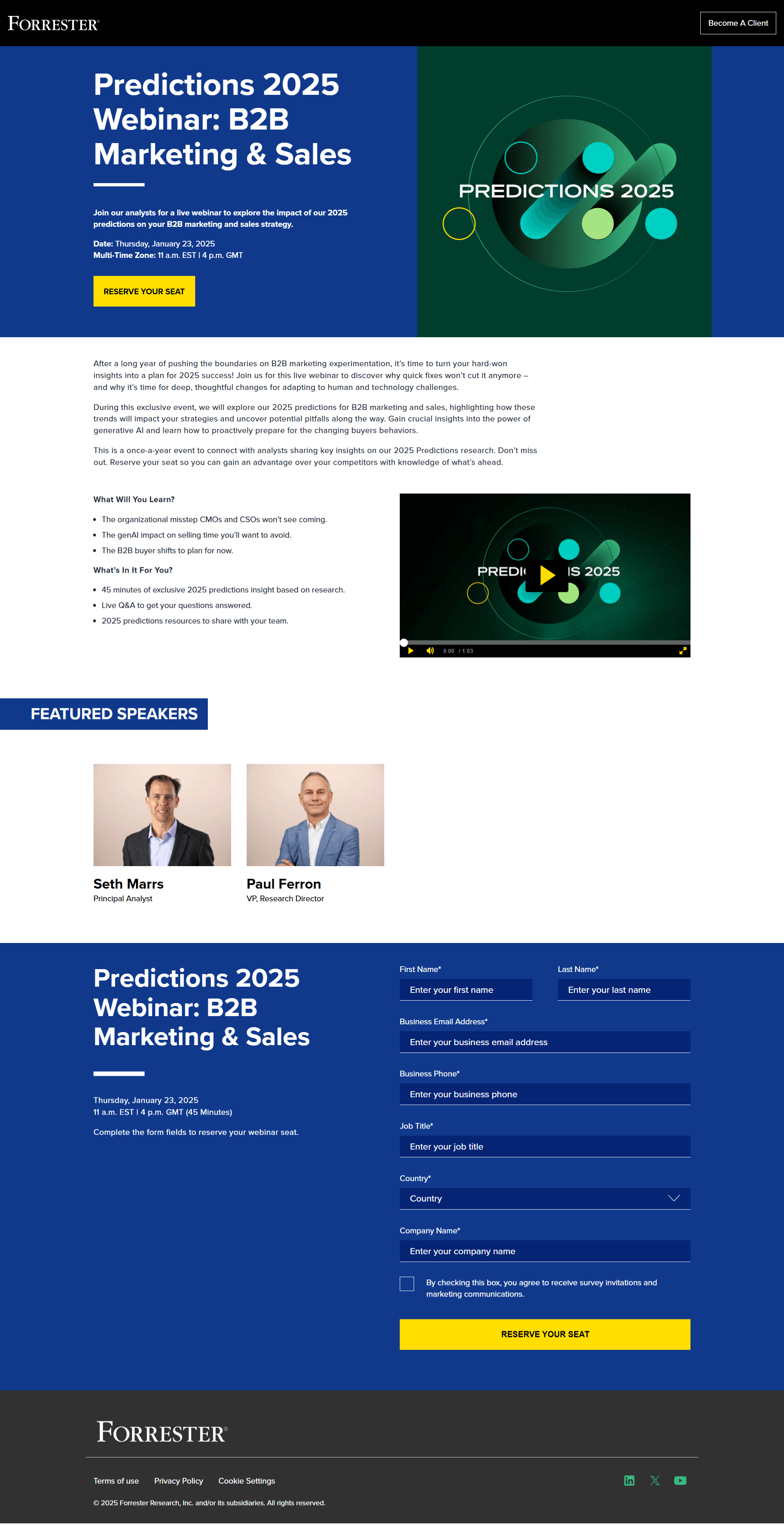
The visual hierarchy of this landing page guides the visitor's journey from value proposition to decision point, while the carefully curated form fields gather essential visitor information without creating unnecessary friction. It captures company names, job titles, and business contact details while including an option for country selection for global audience segmentation. The consent mechanism for future communications is transparently presented, which helps in building trust with privacy-conscious prospects.
2. Click-through pages
Click-through pages are landing pages designed to encourage visitors to take action or learn more before moving forward. Unlike traditional landing pages that immediately push for sales, these intermediate pages act as qualification gates, allowing prospects to self-educate and build confidence before completing an action.
These landing pages strategically present solution capabilities and proof points – all while maintaining a clear path to deeper engagement through strategically positioned calls-to-action. The CTA button usually prompts users to click to another page, for buying, signing up, or downloading something. The design is usually kept simple to minimize distractions and guide users to a single action that leads them to the final conversion page.
A good example is Shopify's click-through page for their free trial. Instead of leading with a generic description of their capabilities, it presents a compelling narrative through a 3-step implementation framework, speaking directly to the visitor's need for quick deployment of eCommerce website.
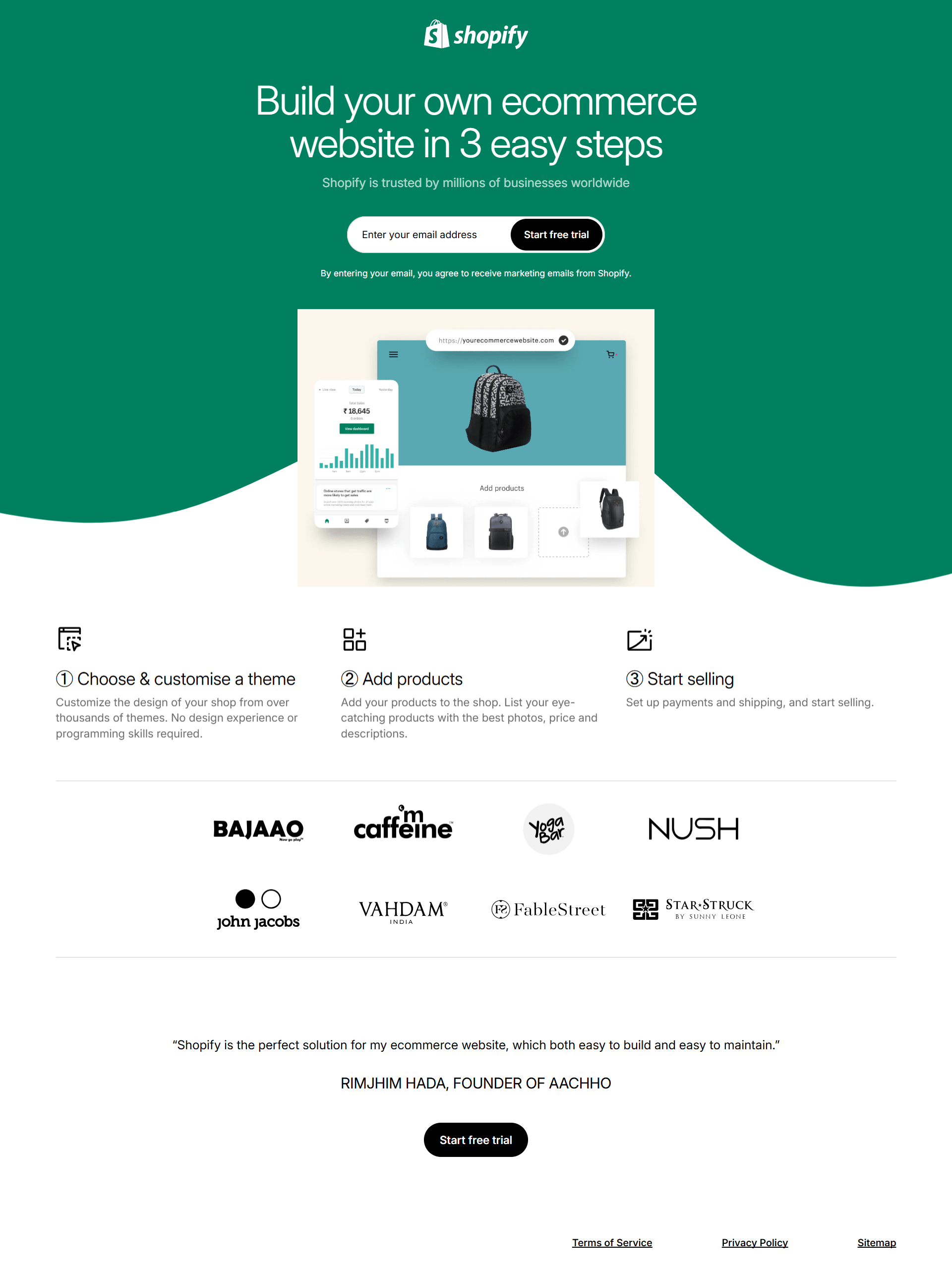
The two call-to-action buttons—one placed above the fold and another after the key value propositions—show an understanding of different buyer engagement patterns. The page's information architecture also shows a logical progression: opening with a clear value proposition, moving to the implementation process, and concluding with social proof from prominent brands.
Particularly noteworthy is how the page maintains clarity despite providing all the information to encourage users to sign up for a free trial. Through careful use of white space and clear sectioning, it avoids the common pitfall of overwhelming prospects.
3. Advertorial landing pages
Experienced buyers usually don't respond to overt sales pitches - they demand substantive, data-driven content that addresses their unique challenges. An advertorial landing page is designed specifically for targeting these buyers by presenting long-form sponsored ad content disguised as informative and educational articles. This type of landing page aims to draw readers in with useful information and gradually introduces them to a product or service in a way that feels natural.
The goal of an advertorial landing page is to convert visitors into customers by subtly promoting a brand's offerings. It often includes storytelling elements, customer testimonials, or additional resources to guide the top of the funnel users towards the next step.
Here is an example of an advertorial landing page from TD Bank. It leads with a hero section featuring relatable imagery and a clear, provocative question that speaks to a fundamental financial decision.
The content architecture uses data visualization and stats (like the 70% and 61% data points) to build authority while maintaining narrative flow. The gradual progression from statistical evidence to practical application, ending with specific recommendations, follows classic thought leadership architecture. Yet it maintains reader trust by consistently prioritizing educational value over product promotion.

What's especially notable is how the page transitions from broad insights into an actionable guide. The "How to Build Credit While Earning Cash Rewards" section addresses reader's potential queries while naturally positioning credit products as solutions.
The "teach, don't sell" approach of this landing page makes it a good example of an advertorial landing page.

4. Microsites
Microsites are standalone websites that focus on a specific purpose. Unlike regular websites that might contain a variety of information and links, microsite landing pages are created for a single goal. This could be to promote an event or marketing campaign, showcase a new product launch, or highlight an initiative. Because they are highly targeted, microsite landing pages are effective for marketers looking to engage their audience and convert visitors.
Creating microsites needs careful planning, much like regular websites. The strategic deployment of microsites demands sophisticated orchestration of UX architecture, content strategy, and conversion engineering. If done right, microsites can be powerful tools for marketers to boost engagement and achieve specific results.
Here’s an example of a microsite from Chipotle, a multinational chain of restaurants. Rather than burying their sustainability story within their main corporate website, they've developed a dedicated microsite to showcase their commitment to ethical and sustainable ingredient sourcing from farmers.
It begins with a short film showcasing the brand’s commitment to supporting the next generation of farmers and then transitions to Chipotle's initiatives ($5,000 seed grants, $5 million to help farmers succeed), finally ending with their "Food with Integrity" commitment. This creates a cohesive narrative that guides visitors from problem to solution.
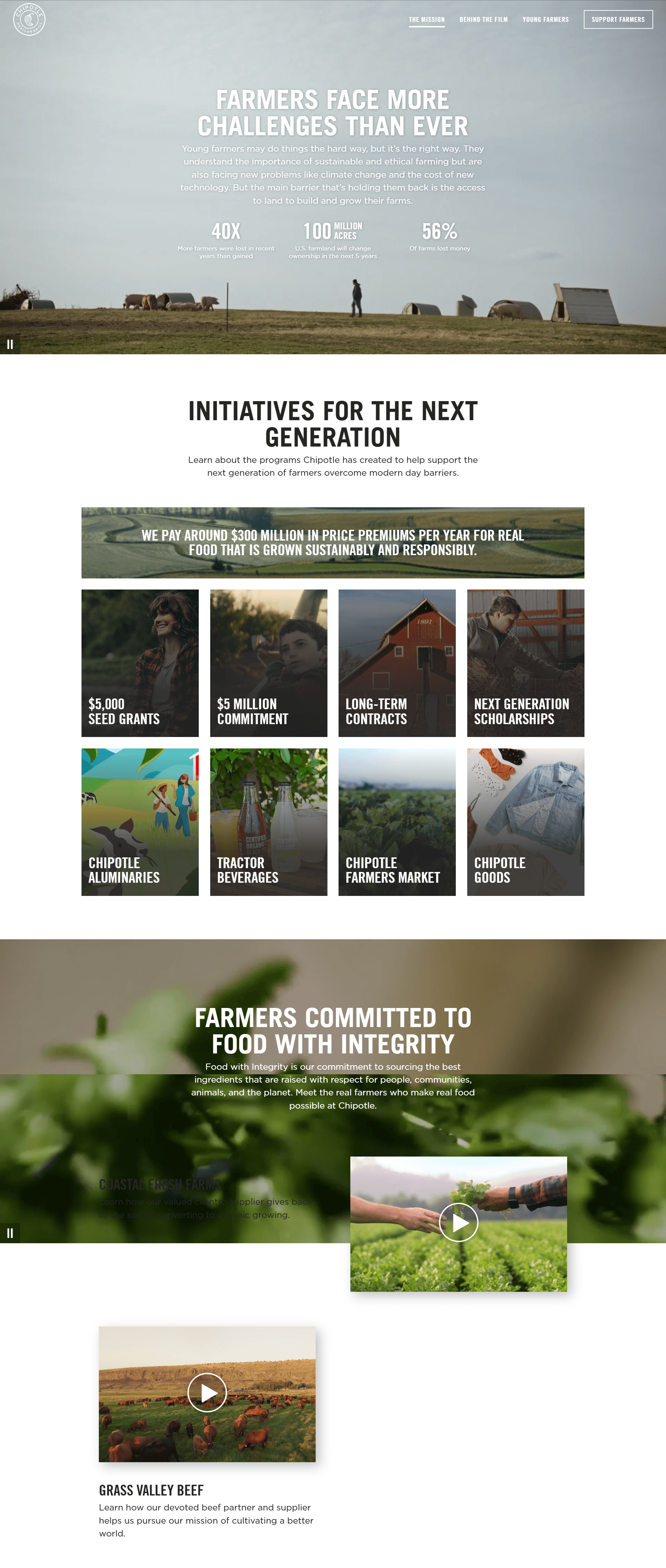
The microsite's design maintains visual consistency with Chipotle's master brand while establishing its own distinct identity. This balance shows how you can create microsites that complement rather than compete with the primary website.
The Chipotle microsite also includes a CTA button urging visitors to support farmers. This demonstrates how microsites can bridge the gap between narrative and action, creating meaningful pathways for audience participation in the brand's mission.
5. Sales pages
Sales pages are landing pages specifically designed to promote and sell a product or service. While most landing pages inform, sales pages are precision-engineered to convert. They are crafted with the goal of persuading visitors to make a purchase by highlighting the benefits, features, and value of the product/service being offered.
Instead of offering generic value propositions, these landing pages hit certain psychological triggers: urgency that creates FOMO without feeling manipulative, social proof that feels authentic, and clear value proposition.
Looking at Coursera's sales page, they've masterfully applied these principles. Instead of vague promises about 'transforming your future,' they lead with specific career outcomes: '77% of learners report career benefits, like landing a new job, earning a promotion, gaining applicable skills.’
It opens with a powerful trust-building trifecta: partnerships with elite institutions like Duke and Google, concrete social proof through learner success metrics, and a risk-reversal guarantee that removes purchase anxiety.
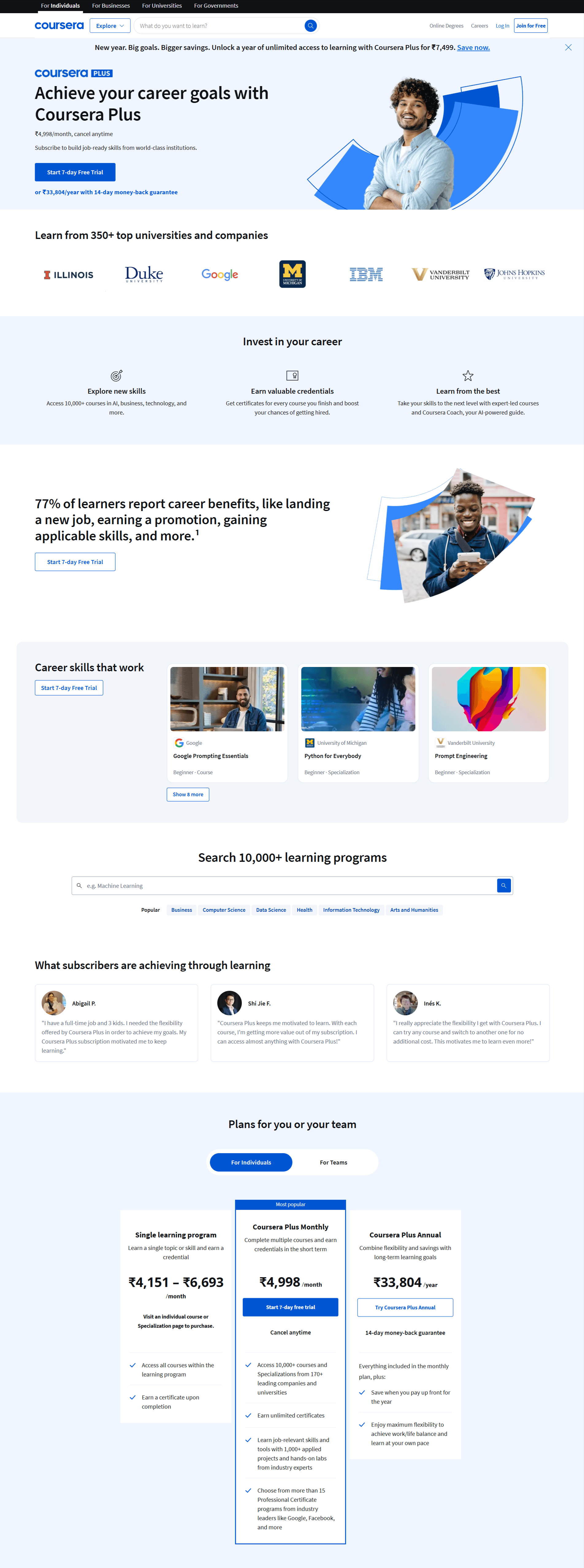
Rather than using anonymous testimonials, they showcase specific learner journeys with real photos and detailed success stories. This transforms abstract benefits into tangible outcomes that potential customers can envision for themselves. The testimonials are strategically placed after the feature presentation but before the pricing section - exactly where buying hesitation typically occurs.
As for their pricing section, it shows a sophisticated understanding of purchase psychology. The page offers three tiers with the middle option positioned as the best choice. They've eliminated decision paralysis by clearly differentiating each tier's value proposition while maintaining enough similarity to keep choices manageable.
The recurring CTA buttons are strategically placed at moments when the visitor has just received useful information, making them feel like natural next steps rather than aggressive sales tactics.
How AI content creators simplify landing page creation
Having explored several landing page examples, you now have an understanding of what works. This means that you can start applying these strategies to your own landing pages. Here’s how you can use Typeface to recreate these landing pages:
Generating landing page copy
To start with the landing page creation, a simple method is to repurpose your existing content into a landing page copy. You might already have a webpage, product description or video with all the content you want included in the landing page copy. With Typeface's AI content repurposing templates, you can easily turn any content into a well-optimized landing page copy.
Pick an AI template based on the content type you want to repurpose. For example, here we used the Text Blend template to turn a product description into landing page copy. To repurpose a web page, select the Web Blend template; for videos, use YouTube Blend; and for files or documents, there’s a Document Transform template. After selecting an AI template, we specified the goal for repurposing as "Rewrite into a landing page copy" and added the original content in the provided field.
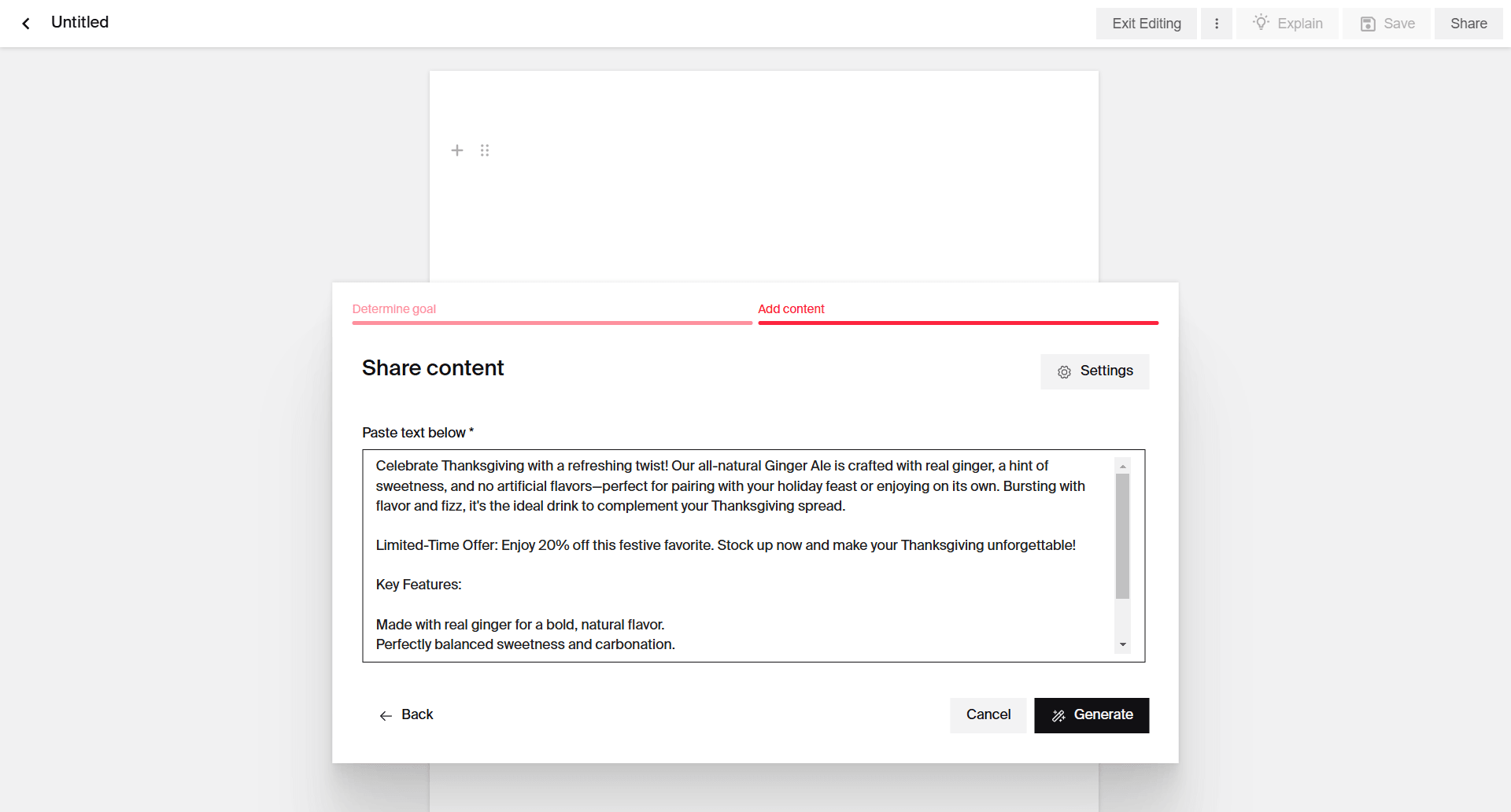
You can also input a custom text prompt in the "Generate Text" option to create a custom landing page copy. Make sure that you put some thought into writing your text prompt, since the quality of the output will depend on how well you craft your input text prompt. Here's a great guide on how to write good text prompts that you might find useful.
Typeface analyzes your inputs to generate a complete landing page framework, including attention-grabbing headlines, benefit-driven subheaders, persuasive body copy, and conversion-optimized CTAs. The AI maintains brand voice consistency while adapting messaging to your specified audience segments and campaign objectives.
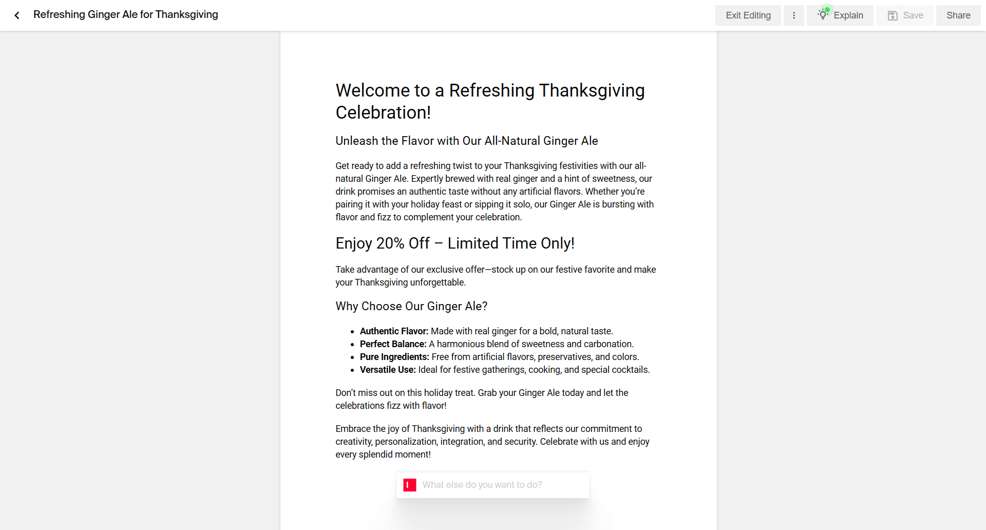
If you're not satisfied with the results, can rapidly iterate on the output by refining prompts or using the one-click regenerate function to explore multiple messaging angles.
Generating landing page banners and visuals
Visuals are essential for grabbing visitors' attention and communicating your message, as we've seen from the landing page examples given above. Typeface Image Studio can generate high-quality landing page images and banners tailored to your brand. It provides a central place for your brand and assets, connecting to your existing digital storage or asset management systems. You can include brand guidelines, documents, logos, product images, and more. If you need to add assets while creating images, you can upload them directly in Typeface.
There are basically three different ways to create landing page visuals:
1. Using Visual Inspiration Studio
The fastest and easiest way to come up with landing page visuals is with Typeface’s Visual Inspiration Studio. Our platform offers a large library of inspiration images across product categories and industries. Simply choose a category or search for a specific theme to discover a wealth of inspiring visuals tailored to your needs. Choose an inspiration image you like, personalize it with your brand assets, and then click generate.
2. Using your product assets and decorations
For even greater control over your landing page visuals, you can arrange your own assets and decorations on a blank canvas first, and then let the AI enhance it from there. This approach lets you edit the placement of the specific elements of your image. You can even add your logo or text to the canvas and retain these features in the AI-generated result.
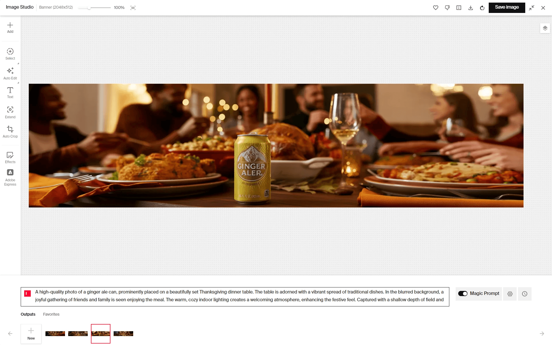
For example, in this image, we set the dimensions to a horizontal banner and placed the product (the beverage can) and some decorations on a blank canvas. After arranging everything to our liking, we added a prompt. The Magic Prompt feature then completes the prompt for us, and Typeface generates the final images. By applying AI Harmonization to fine-tune lighting and shadows, we get the final output.

3. Using AI image prompts
If you already know how you want your banner to look, start a new project on Typeface Image Studio. Choose your banner dimensions and then type out your idea as an AI image prompt. You don't need to be an expert—just include the main details in your prompt and leave Magic Prompt turned on. This feature will automatically improve your prompts with modifiers for better results.
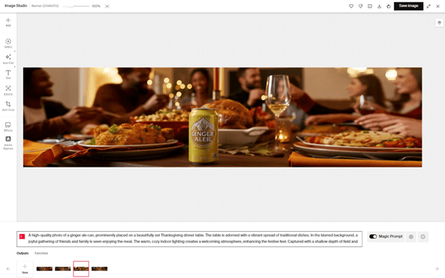
Quick tip: Set the image size to "banner" or "custom" in the Image Studio settings before you begin.
Typeface’s on-brand content creation helps to kickstart your landing page copy and visuals. Once you’re ready, you can publish directly to your CMS with built-in connectors.
Create high-converting landing pages with Typeface
Creating a good landing page is all about combining the right elements—eye-catching design, compelling content, and a clear goal right from the start. After looking at these landing page examples, you have valuable insights into what truly works. Now it’s time to put these insights into action.
Typeface's enterprise-grade AI platform can help marketing teams to create and test multiple landing page variations tailored to specific customer segments and industries—all while saving time. Take one of our customers, a Fortune 500 consumer electronics brand, who used Typeface for creating geo-specific landing pages and hero banners. The result? They scaled to 10+ published banners across geo-specific website domains, each resonating with local audience preferences and cultural nuances.
Book a demo to see how Fortune 500 companies are using Typeface to transform their landing page performance or start your 30-day free trial today.
Share
Related articles

AI at Work
How to Use AI Image Generation Tools to Create Holiday Banners for Landing Pages and Ads

Neelam Goswami · Content Marketing Associate
November 27th, 2024 · 16 min read

AI at Work
40+ AI Copywriting Prompts for High-Converting Ad Copy

Akshita Sharma · Content Marketing Associate
January 17th, 2025 · 13 min read

AI at Work
6 AI Product Photography Ideas for Captivating Ad Campaigns

Neelam Goswami · Content Marketing Associate
November 14th, 2024 · 12 min read